U.S. bank failures since 2000
- Resources used for this data analysis
- Insights
- Limitations of the dataset
- Access my workbook
- BONUS: Data visualization via Power BI
Using a simple dataset from Data.gov, I’ve put together some insights about U.S. bank failures since 2000.
My past experience (the land side of the oil and gas industry) doesn’t scream data analysis, but as I have a habit of wearing many hats at every job, I have drifted in that direction at times. Unfortunately, I can’t share my best piece of data analysis–a project that saw me automate calculations for over 100,000 row of data with a bunch of detailed SUMIF statements, due to the proprietary nature of the data.
The hardest part of building a data analysis portfolio seems to be finding data to work with. The first few datasets I downloaded were chaotic and hard to make basic sense of. Luckily, I quickly stumbled upon the simple dataset that guided this project.
Resources used for this data analysis
Below are the few resources I used for my data analysis:
- CSV file from Data.gov1
- Microsoft Excel
- A computer at the library (Long story I won’t dive into)
About the data
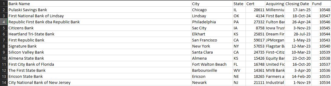
The data originated in CSV format and was simple compared to the project including over 100,000 rows of data I mentioned above–this dataset has 572 rows with 7 columns, totaling around 4,000 cells of data.
Below is a screenshot preview of the basic data:
For this project, I leaned on the following columns:
- Bank Name
- City
- State
- Acquiring Institution
- Closing Date
Insights
Below are answers to some of the questions I had when considering this dataset.
Total U.S. bank failures since 2000 by location
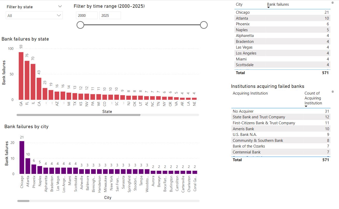
I first asked myself which states had the most total failures in the 21st century.
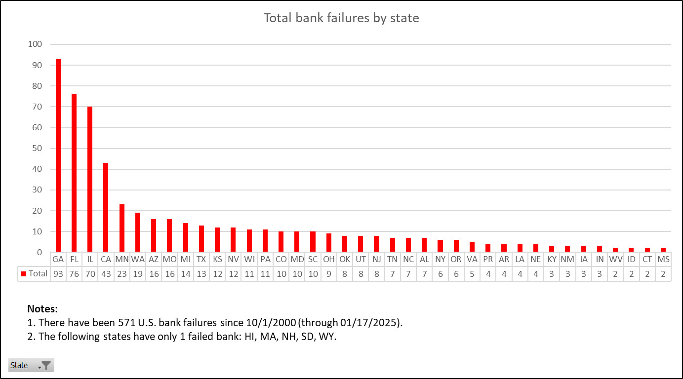
Georgia dominated with a total of 93, accounting for 16% of all bank failures.
The top 5 is rounded out by the following states (with their respective failures in parentheses):
- Florida (76)
- Illinois (70)
- California (43)
- Minnesota (23)
After Minnesota, you see the numbers start on a steady decline.
Five states had only one failed bank:
- Hawaii
- Massachusetts
- New Hampshire
- South Dakota
- Wyoming
NOTE: I wanted to report on all the states missing from this dataset (meaning they’d had no bank failures since 2000), but if you look at every single entry on the chart above, you’ll see ‘PR’–Puerto Rico. The dataset didn’t tell how many U.S. territories are considered, so I don’t know how many territories are missing. I also don’t know if Washington, D.C., would count as a ‘State’ in this instance.
The dataset tells what cities have had banks fail, so I was curious which cities ranked in the top 10.

I was interested to see that while the state of Illinois ranked #3 in terms of U.S. bank failures since 2000, the state is in fact home to the city with the most bank failures: Chicago.
Even though Georgia dominated the rankings by state, only two Georgia cities (Atlanta and Alpharetta) appear in the top 10 cities for bank failures. This observation suggests that Georgia’s bank failures are scattered throughout the state and makes one wonder what impact bank failures are having on communities both large and small.
Depending on your intentions for this data, you might want to analyze how many cities these bank failures are scattered across certain states. Just by glancing at the two charts above, we can see that 30% of the bank failures in Illinois are concentrated in Chicago (21 out of 70 total bank failures for the whole state).
Total U.S. bank failures since 2000 by year
Which year has seen the most U.S. bank failures since 2000?
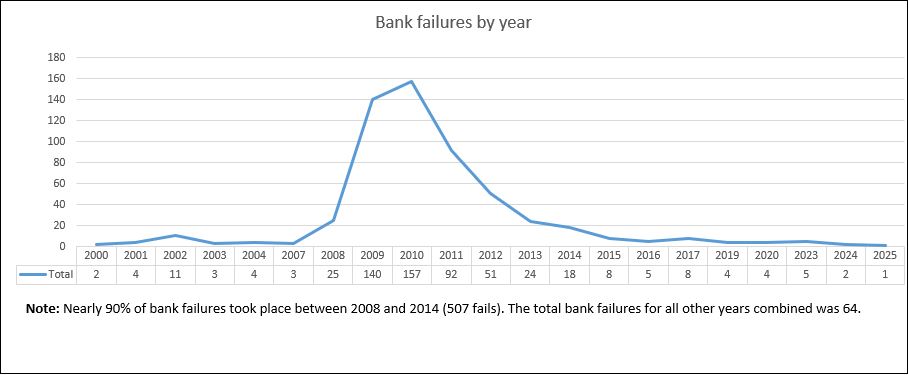
The answer: 2010, with a grand total of 157.
While scanning through the results, something caught my eye.
The results start a reasonable decline at 2002 (8th place on the list). But all the years ranked higher are sequential (2008-2014), accounting for nearly 90% of all U.S. bank failures since 2000 (507 fails out of 571 total). All the remaining years combined account for only 64 out of 571 total bank failures.
That concentration of bank failures from 2008-2014 reinforces what most of us already know: We felt the effects of the 2007-2008 financial crisis for far longer than just 2007 and 2008.
Top acquirers of U.S. bank failures since 2000
Failed banks are often acquired by surviving, more resilient institutions.
So which institutions have gained the most from U.S. bank failures since 2000?
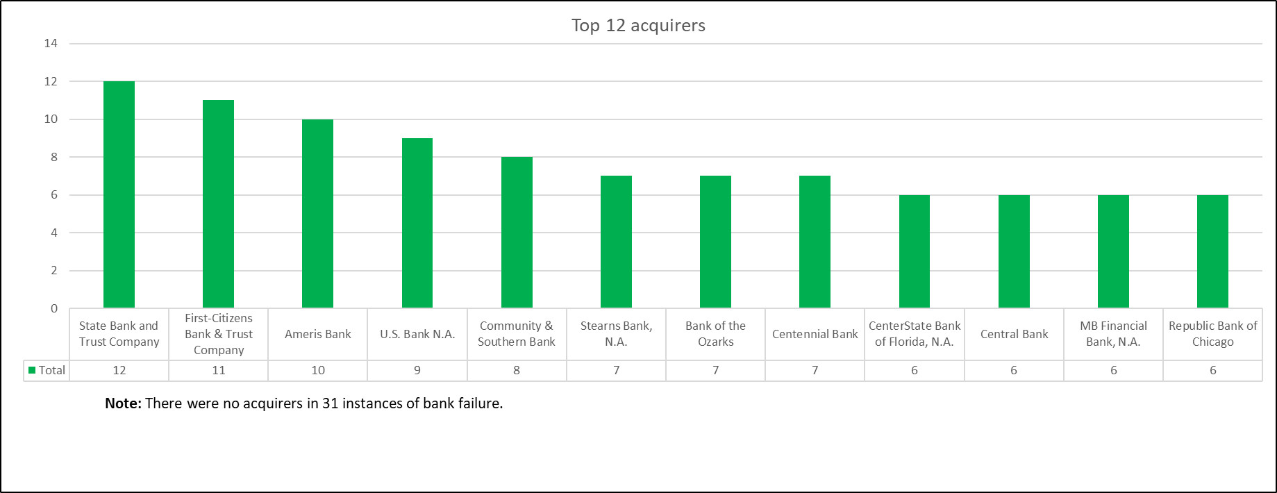
State Bank and Trust Company leads the pack with 12 acquisitions.
I’ve had a few takeaways while examining the results:
- These results are far more consistent than the results of the previous charts. The leader, State Bank and Trust Company, has had twice as many acquisitions as the four bottom banks on this list (each with six aquisitions), but the overall decline is steady. The top-12 acquirers account for only 95 acquisitions.
- There were no acquirers in 31 instances of bank failure. So what happened to those other banks? (Is this something I would know if I were looking at this data as part of my day job, such as if I worked in finance?) Did the government maintain the responsibility for these failed banks?
- I expected to see more acquisitions by the largest banks, such as J.P. Morgan Chase, Bank of America, and Wells Fargo. But neither of those institutions makes the top 12.
Limitations of the dataset
In this portion, I want to touch on the limitations of the dataset and some additional questions I have that can’t be answered with the data as is.
What territories are considered for this dataset?
In the geography portion, I included a note about how it wasn’t clear what U.S. territories were considered for this data. Puerto Rico has had four bank failures since 2000–but how many other territories have had none so far but may be included in updates?
How much in assets was under management for each failed bank?
This dataset lets us see the number of U.S. bank failures since 2000, but it doesn’t show us the magnitude of the failures.
While Georgia had the most total bank failures, maybe they had fewer assets under management compared to other states. Chicago is an American financial hub, so I wouldn’t be surprised if the total failure in terms of assets under management was much higher in the state of Illinois than Georgia.
How much of assets under management was FDIC insured?
Were all owners made whole after each U.S. bank failure since 2000? This question is kind of a continuation of the previous question. But the question could be reworded as: How much did account holders lose in each bank failure?
Access my workbook
If you want to look at the Excel workbook I used for my data analysis, you can find it here.
Below are a few notes about my worksheets:
- The tabs in green are my deliverables (the clean versions of my analysis that I featured in my data analysis). These are the reports I’d show to my boss if I were doing this for my day job.
- The tabs in yellow are my scratch files (where I worked through the data). These tabs aren’t something I’d show to my boss, but they’re worth keeping around to show my work or referencing later if any questions pop up. You’ll see that most of the insights came courtesy of basic pivot tables within these tabs.
-
The tabs in red are my data tabs. The ‘data_raw’ tab is the pure raw data that I imported from the CSV file found on Data.gov. I password protected this tab to make sure I always had a copy of the raw data in my workbook. (If you want to mess with this tab for some reason, the password is ‘12345’. Yes, the password an idiot keeps on his luggage.)
The ‘data_cleaned’ tab includes any changes I made to make the data more usable. For this project, I believe I made only minor changes and additions regarding the dates of the failures.
BONUS: Data visualization via Power BI
My original analysis was done exclusively in Excel. I’ve since added a simple data visualization report via Power BI to condense this analysis.
This Power BI dashboard consolidates all the previous data analysis into one place.
Using the filters at the top, you can customize the report by state and date range (in years).
Say you want to see how Arizona has done from 2009 through 2025.
Simply change the parameters of the report via the filters, and you get the answers you’re looking for.
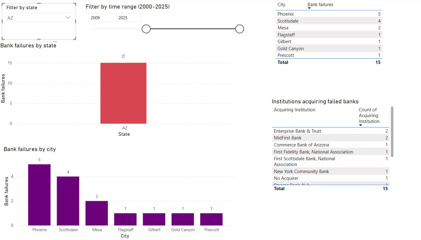
We can simply see:
- Arizona has had a total of 15 bank failures from 2009 through 2025 (via the top chart).
- The city of Phoenix has had the most bank failures (5) in Arizona during this time (via the bottom chart). Scottsdale is close behind with 4 bank failures.
- The bottom table shows us that Enterprise Bank & Trust and MidFirst Bank acquired the most failed banks, with 2 each.
- The top table (listing the cities with failed banks) looks useless in this example, but it might come in handy when looking at a state like Georgia, which led the pack with the most bank failures from 2000 through 2025.
If you want to look at my Power BI dashboard, you can find the file here.
-
FDIC failed bank list data from Data.gov ↩